

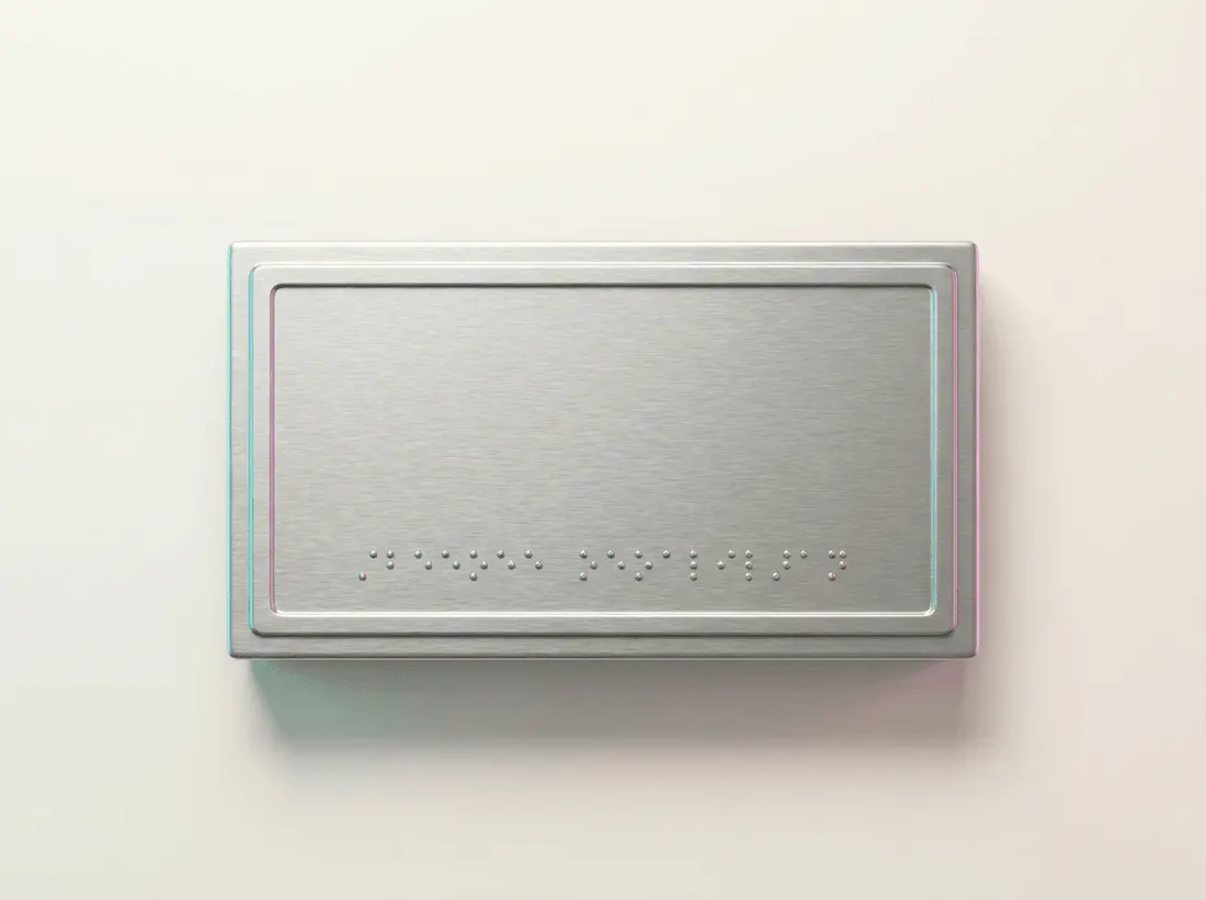
ADA wayfinding signs help visitors follow directions and recognize their destination. Start by separating those jobs. Directional arrows generally need compliant visual lettering, while signs identifying permanent rooms and spaces generally require raised characters and Braille. For a California business, plan both together so the route leads to a clearly identified doorway.
Which ADA wayfinding signs does my building need?
Walk from arrival to destination. Identify the entrance and reception area, then check corridor junctions, restrooms and permanent rooms. Record every place visitors must choose a direction or confirm they've arrived. A corridor arrow reading “Restrooms” and the identification beside the restroom serve different purposes. You'll need to account for both.
Build a sign schedule before choosing sizes or colors. Give each location a reference and record its exact wording, arrow direction, quantity and proposed mounting surface. Separate permanent room identification from directional messages, directories and exit signage. Bring the schedule to Angels Print’s ADA signage service to discuss sign types and production details.
Do directional signs need raised letters and Braille?
Generally, directional signs follow visual requirements rather than tactile requirements. Permanent room identification generally needs raised text and contracted, or Grade 2, Braille. Directories have a federal exemption. Don't automatically specify them like corridor direction signs. The U.S. Access Board’s signs guide explains these distinctions.
“Restrooms →” belongs on a directional panel; permanent restroom identification belongs at the room. Matching colors don't make a printed arrow panel tactile. Check the function first. ADA Braille Signs, from $30.58, are the relevant product starting point for tactile identification. Confirm the wording and configuration before ordering.
How should I choose lettering, contrast and panel size?
Set the message before the size. Someone reading across a lobby needs a different layout from someone beside a door. Keep destination names short and consistent. If the entrance sign says “Reception,” don't switch to “Main Office” halfway along the route unless you intend that distinction.
Covered visual signs require non-glare finishes and contrasting characters and backgrounds. Lettering must suit the viewing distance and mounting height; ADA Standards Section 703 also addresses character proportions and spacing. Request actual dimensions on the proof. Check letter heights, margins and arrows, leaving enough room for the destination to read more clearly than the logo.
Where should tactile room signs be installed?
For a typical single door, tactile identification belongs beside the latch side. Federal mounting measurements use character baselines: the lowest tactile character must be at least 48 inches above the finished floor, and the highest no more than 60 inches. Don't measure to the panel’s center. Door configurations and approach clearance also matter; consult the Access Board’s placement guidance.
Photograph each doorway open and closed, including nearby switches, trim, glazing and furniture. Ask the installer to confirm applicable California measurements and door-swing clearance. Put placement details on the schedule. A correctly manufactured panel can still be installed incorrectly if its location is left to an on-site guess.
What changes for California restroom signs?
California restroom identification includes geometric entrance symbols: a triangle for men, a circle for women, and a triangle superimposed on a circle for unisex facilities. These differ from tactile wall identification. Where a door is provided, the geometric symbol sits near its vertical centerline, with its centerline 58–60 inches above the floor. See California Building Code Chapter 11B.
California tactile signs need uppercase, sans serif raised letters. Letters must be raised at least 1/32 inch and measure between 5/8 inch and 2 inches tall. Review Braille and spacing, too. Ask for specifications addressing federal standards and the California code applicable to your project, including Section 11B-703. An “ADA” product label doesn't establish every required detail.
Which materials and finishes should I order?
Choose materials for the location. Interior tactile signs may use plastic laminate, photopolymer or acrylic, but a material name alone doesn't establish compliance. Ask how the raised lettering and Braille will be produced. Confirm the finish and wall attachment before approving the panel.
For visual branding or directional panels, Acrylic Business Signs start from $46.76. An Acrylic Standoff Sign, from $37.50, is another wall-display option. Check glare and mounting projection alongside readability. Specify decorative acrylic panels separately from required tactile identification unless the proposed configuration explicitly satisfies both.
Separate temporary event directions on your schedule so they can be removed without disturbing permanent identification. Outdoor panels need location details. Describe sun and rain exposure, cleaning and the mounting surface when requesting specifications. A preferred color or reference photo won't answer those questions.
How do parking and entrance signs fit the route?
Review accessible parking and the route to the entrance together, including any entrance directions. Have the project reviewer confirm applicable parking identification, van-accessible designation, California notices and mounting details before fabrication. Record existing wording and take photos. Don't assume a replacement template covers everything the location needs.
Walk the proposed route yourself. Check that each arrow leads to the intended entrance and that furniture or landscaping doesn't obscure it. Coordinate exterior identification through Angels Print’s signage service. For the relationship between a front sign, suite door and back entrance, see Signage and Front Signs in Encino.
What should my quote and artwork include?
Use the sign schedule when requesting a quote so quantities and configurations are clear. Ask the estimator to explain how panel size, material, tactile production and mounting choices affect your total. Starting prices are a planning reference. Request pricing for the specified panels before approving the order.
Confirm file setup requirements before preparing artwork, including the accepted file format and how dimensions should be shown. Supply exact wording and arrow directions against each schedule reference. Request a dimensioned proof for review. For tactile panels, ask for dimensional specifications and verified Braille translation rather than relying on the artwork’s appearance.
What should I check before placing my order?
Compare every proof with the schedule. Confirm room names and arrows first, then quantities, material, finish and mounting method. For restrooms, check that all required components are included. After a remodel or tenant change, walk the route again to catch directions pointing toward an old layout.
Resolve unclear requirements before production. Have the project’s accessibility professional or a Certified Access Specialist review uncertain scope or installation details. Keep the approved schedule with installation instructions so the buyer, fabricator and installer work from the same information.
Order your ADA wayfinding signs online from Angels Print, call to discuss your schedule, or visit the shop in Sun Valley, CA. Bring your room list and doorway photos, along with approved requirements, to choose panels and mounting details for your space.
Frequently asked questions
What are ADA wayfinding signs?
ADA wayfinding signs provide accessible directions and destination identification. Requirements depend on the sign’s function. A directional panel and a permanent room sign generally need different specifications.
Do all ADA wayfinding signs need Braille?
No. Directional signs generally need compliant visual lettering, while permanent room identification generally requires raised characters and Braille. Specify the function before ordering.
How do I choose ADA wayfinding signs for a California business?
Map the visitor route first. List permanent rooms and directional decision points, then confirm applicable federal and California requirements. Include restroom identification and installation locations, plus directions to the entrance.
Can acrylic panels be used for ADA wayfinding signs?
Yes, but material alone doesn't establish compliance. Check the complete sign specification. Lettering, finish and contrast must suit its function, along with tactile features where required and the installation details.