

September 15, 2026
Digital Printing in Van Nuys: Short Runs, Real Numbers and What Comes Off the Press
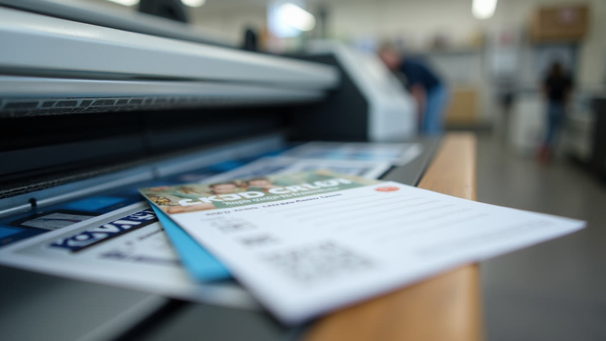
Van Nuys runs on paper more than most of the Valley. The civic center, the courthouse and the county offices pull a steady stream of people who arrive with a folder and leave with another one; the boulevard is lined with auto shops, insurance offices, immigration and tax practices, clinics and contractors, most of them small enough that a print order means fifty or a hundred pieces, not a pallet. That is exactly the shape of job digital printing exists for, and it is why the question people usually arrive with — can you do a small run without it costing a fortune — has a straightforward yes at the end of it.
We run digital printing at the shop in Sun Valley, a few minutes up Sherman Way and Lankershim from most of Van Nuys. Below is how we think about these jobs: what the process actually changes, where the money sits, and what we need from your file.
What digital changes is the setup, not the ink
Offset printing puts your artwork onto physical plates, then transfers ink from plate to blanket to paper. Those plates are the reason offset is cheap at volume and expensive at fifty pieces — you pay to make them whether you print a hundred sheets or a hundred thousand, and you pay again every time the artwork changes. Digital printing skips that step entirely. The file goes to the press and the press images every sheet on its own.
Three practical consequences follow. Small runs stop being punished. There is no fixed plate cost to spread across the order, so fifty pieces costs roughly fifty pieces' worth. Changes are cheap. Fixing a phone number between one order and the next costs nothing but the time to re-send the file. Every sheet can be different. Numbered tickets, sequential invoices, names and addresses that vary piece to piece — that is variable data, and it is only possible because nothing is locked into a plate.
What digital does not change is physics. Ink or toner still has to sit on a sheet of paper, and paper still absorbs, curls and cuts the way it always did. Digital is a different way of getting the image down, not a different set of rules about what paper does with it.
Where the crossover sits
The honest way to decide is to price the job both ways at the quantity you actually need. Digital wins decisively at the low end and loses at the high end, and the crossover for most flat printed pieces sits somewhere in the low thousands — the exact number moves with size, stock and how many colors and finishes are involved.
For most Van Nuys businesses this is not a close call. If you need a hundred rack cards for a lobby, three hundred postcards for a neighborhood, or two hundred cards because you just hired two people, digital is the answer and offset was never in the running. The mistake worth avoiding runs the other direction: ordering five thousand of something because the per-piece price looked good, when the address on it changes in eight months. Quantity you throw away is more expensive than quantity you never bought.
Cards are the volume item, and fifty is a real order
Classic business cards start at $25.70, which is fifty cards at $0.51 each. That is small enough that a card can be treated as a working document rather than a monument. New hire, new suite number, a second phone line that actually gets answered — reprint it.
The failure we see most often on cards is not design, it is legibility. Type below about 7 point, thin light weights, and low-contrast gray-on-white all look fine on a monitor at 300% zoom and read as mush in someone's hand under fluorescent lighting. If your card carries a license number, a DRE number, a suite, or anything a customer has to copy correctly, set it in something you can read across a desk without squinting.
Bleed matters here more than on anything else, because the trim is a tiny fraction of the piece. Extend any background color or image past the edge, and keep text a healthy margin inside it — text that sits a hair from the cut line looks like a mistake even when the cut is perfect.
Postcards do two different jobs
Postcards start at $35.61 for fifty, $0.71 each. Half the postcards we print are mailed and half are handed over a counter, and the two want different layouts.
A mailed card has to reserve real estate. The address side needs a clear block for the address, the indicia or stamp area and a barcode zone, and if you cover that area with artwork the post office will have something to say about it. Confirm the layout requirements for the mailing method you plan to use before you commit to a design — the rules are the post office's, not ours, and they are stricter about the address side than people expect.
A counter card has no such constraint and can use both faces freely. For a service business on Van Nuys Boulevard — a shop explaining what a service actually includes, a clinic listing what it treats, a contractor showing three finished jobs — the back is the useful side, and the front is what makes someone keep it instead of leaving it on the counter.
Either way, one offer per card. A postcard that lists six services gets read as a list and remembered as nothing.
Rack cards live in other people's lobbies
Rack cards start at $51.71, twenty-five cents over a dollar a piece at fifty. The format exists for a specific physical situation: a wall rack or countertop holder where a dozen cards are visible and only the top two or three inches of yours is showing.
That top band is the whole design problem. Whatever is in it has to say who you are and what you do, because that is all anyone sees before deciding to pull the card out. A logo alone rarely does it — a logo plus four words usually does. The rest of the card is for the person who has already committed to reading it, standing up, holding it.
Van Nuys is unusually good territory for this format, because so much of the area is places where people wait: medical and dental offices, the civic center and courthouse corridors, service waiting rooms along the boulevard. Ask before you leave a stack anywhere — a rack card sitting somewhere it was not welcome is just litter with your phone number on it.
Booklets, and why twenty-five is a real number
Saddle stitch booklets start at $68.85 for twenty-five copies, $2.75 each. Saddle stitch means folded sheets nested inside each other and stapled through the spine, which is why the page count has to be a multiple of four — every sheet contributes four pages, two on each side.
Plan the page count before you write the content, not after. A twelve-page booklet is three sheets. A thirteen-page booklet is four sheets with three blank pages, and those blanks will end up somewhere you did not choose unless you place them deliberately.
Twenty-five copies of a catalog, a service menu, a program or a capabilities booklet is a quantity that only makes sense digitally, and it is the right quantity when the contents are going to change — a price list, a seasonal menu, a product range that grows. Print what you need for this quarter and reprint when the facts move.
Color, and what to expect from it
We print device CMYK and hold total ink coverage at or under 260%. Two things follow from that, and both are worth knowing before you approve artwork.
Bright saturated RGB does not survive the conversion. The electric blues, hot greens and neon oranges that a screen produces with light are outside what four inks on paper can reach. They convert to the nearest achievable color, which is duller. This is not a press problem, it is the difference between emitted and reflected color, and it applies to every printing process ever invented.
Rich black needs building, and needs restraint. A large black area printed with black ink alone looks washed and slightly gray next to a photo. Adding cyan, magenta and yellow underneath deepens it — but a four-channel black at full strength is 400% ink, far past what the sheet can absorb, and it will offset onto the next sheet in the stack. Keep it under the 260% ceiling. Small black text stays 100% black only: adding other channels to 8 point type just makes it look blurry if registration moves by a hair.
If the color has to match something that already exists — an existing sign, a vehicle wrap, last year's brochure — bring the physical piece in. Matching to a printed sample is a solvable problem. Matching to a memory of a screen is not.
Files
Send PDF with fonts embedded or outlined, built at final size in inches, with bleed all round and crop marks. Images at 300 ppi at the size they print — a photo that is 300 ppi in your layout at two inches is 100 ppi if you scale it to six.
Build in CMYK rather than leaving an RGB file for us to convert blind, keep total ink under 260%, and flatten transparency effects if your layout program is doing anything exotic with blend modes. Tell us the finished size, the quantity, the stock and whether the piece is single or double sided — those four facts answer most of what we would otherwise have to ask.
One thing worth saying plainly: we do not alter your colors. We record the original values, print, and check the result against what came in. If something needs to change to print correctly, you hear about it first.
Angels Print runs digital printing for cards, postcards, rack cards and booklets at 8511 Lankershim Blvd in Sun Valley, for businesses across Van Nuys and the San Fernando Valley. Our Van Nuys digital printing page lays out the same options in one place. If your artwork is ready, pick your quantity and order online. If you are still deciding between a postcard and a rack card, working out a page count, or trying to match a color you already have, call us at (818) 806-9006 or bring the piece into the shop and we will sort it out with you first.