

August 22, 2026
Classic Business Cards in Los Angeles: What to Specify Before You Print a Run
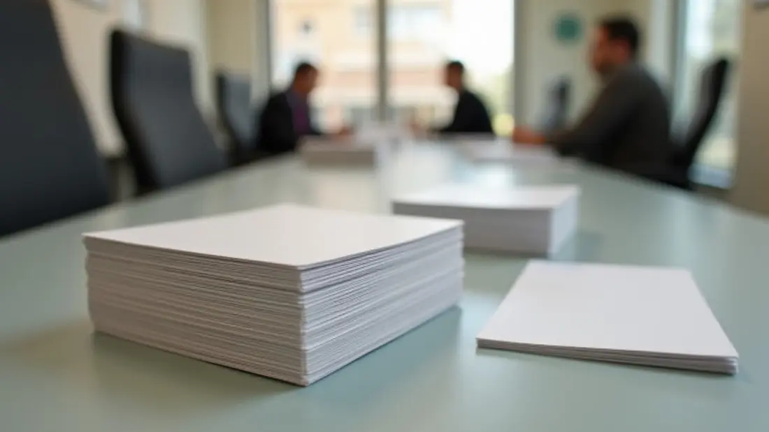
The most common order that comes through our shop is also the smallest: a stack of standard business cards, 3.5 by 2 inches, printed both sides. It is the cheapest thing we make and the item people agonize over the longest, usually about the wrong variables. Almost nobody asks about bleed or ink coverage on a dark background — the two things that actually decide whether the finished card looks professional or looks like it came out of a vending machine at a mall. They ask about thickness and gloss, which matter, but less than they think. This is the sorting conversation we have at the counter on Lankershim, written down.
What "classic" means on an order form
A classic card is a rectangle of coated or uncoated card stock, cut to 3.5 × 2 inches, printed four-color on one or both sides, with square corners and a straight trim. Nothing is folded, punched, foiled, embossed or cut to a shape. That is it, and that plainness is why it is inexpensive: the whole run gangs up on a sheet, gets printed in one pass and gets trimmed in one stack. Our classic business cards start at $25.7, and the default run the configurator opens with is 50 pieces at $0.51 each.
Fifty is a starting point, not a recommendation. Fifty cards is a week of handing them out if you are actually working a trade or a territory. The per-piece cost falls sharply as the run grows, because the setup is the same whether the press produces fifty or a thousand — you are paying for the sheet and the click, not for the file. Set the quantity to what you will realistically hand out before your phone number, title or address changes, then add a margin. Which brings up the one real argument for printing fewer: if you are a new business and anything on the card is still provisional, print a small run deliberately and reprint. Boxes of obsolete cards in a closet are the most common form of wasted print budget we see.
The stock is most of the impression
Weight is the first thing a person notices, and it registers in the hand before the eye reads the logo. The common range for business cards runs from around 14pt up to 16pt for a standard card, and the difference between them is genuinely noticeable — 14pt is fine and unremarkable, 16pt reads as deliberate. Below that you get into stock that flexes when someone holds it by one corner, and a card that bends in the hand undoes whatever the design was trying to say.
Coated or uncoated is a separate decision and it is about function, not luxury. Coated stock holds ink on the surface, so colors stay saturated and photographs look sharp. Uncoated stock absorbs ink, which softens color slightly and makes fine type look a touch heavier, but it takes pen. If people are going to write on the back of your card — appointment times, a quote, a name — uncoated is not optional, it is the only choice that works. Ballpoint on a glossy coated card smears and then rubs off in a pocket. Contractors, clinics and anyone who books by hand should be starting from uncoated.
Gloss, matte, and the fingerprint problem
Gloss coating is durable, cheap, resists scuffing and makes color pop. It also reflects, which means a gloss card under the overhead lights of a conference room is partly a mirror. Matte or soft-touch finishes look and feel more expensive and photograph better, and they are the current default for anyone selling a premium service.
The trap with matte is dark coverage. A matte card with a solid black or deep navy field shows every fingerprint, and it scuffs — you can put a visible grey scratch across it with a fingernail. If your design is a dark field edge to edge and you want matte, understand that the cards at the bottom of the box after three months in a bag will not look like the cards on top. Either accept it, choose gloss for the dark side, or move to a heavier construction where the surface is more forgiving.
File setup, in the order it goes wrong
Build the artwork at 3.75 × 2.25 inches. That is the trim size plus an eighth of an inch of bleed on every side. Any background color or image that is supposed to run off the edge must extend to that full 3.75 × 2.25 — if it stops at the trim line, the cutter's normal tolerance will leave a hairline of white paper along one edge, and it will be along a different edge on different cards in the same stack.
Then pull the important content in. Keep type, logos and anything you would be annoyed to see clipped at least an eighth of an inch inside the trim, and a quarter inch if you can afford the space. Cards are trimmed in stacks and the stack shifts a little; the guillotine is accurate but it is not accurate to zero. Text set flush to the edge looks like a design decision on screen and looks like a mistake in the box.
The rest of the checklist is short. Images at 300 dpi at final size — a logo grabbed off a website will look soft at any size on a card. Colors in CMYK, not RGB, and not in a screen-only profile. Text converted to outlines, or fonts embedded in the PDF. For solid black backgrounds use a rich black build rather than 100% K alone, which prints as a washed dark grey over a large area. And set a single 0.125" bleed with crop marks in the export, not a hand-drawn rectangle.
Color, and what a screen cannot promise you
Four-color process on a digital press reproduces a wide range but not everything, and the failures are predictable: bright oranges, deep royal blues, and any vivid green tend to land duller than the monitor showed. Your monitor is backlit and your card is not, so even a perfect match reads differently. If your brand color is specified as a Pantone, tell us the reference rather than sending a screenshot and hoping — knowing the target lets us get as close as the process allows and lets us tell you honestly if it will not get there. The mechanics of that reproduction are the same across everything we run on the digital equipment, which we cover under digital printing if you want the longer version.
If exact color matters to you — a franchise standard, a brand book you have to answer to — ask for a printed proof before the full run. Looking at a physical card under office light settles arguments that no amount of emailing PDFs back and forth will.
When a classic card is the wrong card
There are three situations where we push people past the standard stock, and each one is a specific job rather than a general upgrade.
The first is when you need the card to survive being looked at. Clear plastic business cards start at $92.6, default run 50 at $1.85 each. They are waterproof, they do not dog-ear, and the transparency is the whole effect — which means the design has to be built for it, with real empty space where the card is meant to read as clear. A layout designed for white paper and moved onto plastic just looks murky.
The second is shape. Die cut business cards start at $129.14 with a default run of 100 at $1.29 each — rounded corners, a cut silhouette, a shape that matches what you sell. A die cut card does not sit flat in a stack with everyone else's, which is the point. Keep the cut simple and away from thin protruding elements; a narrow tab will fold over in a wallet.
The third is weight for its own sake. Double thick duplex cards start at $152.14, default run 100 at $1.52 each. Two sheets bonded together give you roughly double the caliper and a visible edge in profile, often in a contrasting color. It is the card that gets commented on when it is handed over, and it is the one we recommend when the card itself is doing sales work — architecture, design, real estate at the higher end, anything where the object is part of the pitch.
What the card has to do here
Los Angeles still runs on handed-over cards more than people expect. Contractors and trades leave them at job sites across the Valley. Real estate agents put them in every listing packet. Restaurants stack them by the register. Crew and freelancers hand them out on set where a phone screen is useless and everyone's hands are full. The common thread is that the card gets used in bad conditions — a pocket, a truck dash, a tool bag — which is an argument for the heavier stock and against the delicate finish.
One practical addition worth planning for at the design stage: if you are putting a QR code on the back, give it real quiet space around it and enough size to scan from a hand's distance. A code shrunk to fit a crowded corner is a code nobody scans. And leave the back of the card usable if your business involves booking — the back of a card is free advertising space that most designs waste on a repeat of the logo. The full range of what we do with cards, including the specialty constructions, is under business card printing.
Angels Print prints classic, plastic, die cut and double thick business cards at our shop at 8511 Lankershim Blvd in Sun Valley, for trades, offices, restaurants and studios across the San Fernando Valley and greater Los Angeles. If your file is built at 3.75 × 2.25 with bleed and set in CMYK, pick the stock, finish and quantity and order online from the full business card catalogue. If you are still deciding between coated and uncoated, or you want to feel the 16pt against the duplex before committing to a run, call us at (818) 806-9006 or stop by the shop and we will put the stocks in your hand.