

August 26, 2026
Floor Graphics in Los Angeles: Where They Stick, Where They Slip, and How Long They Last
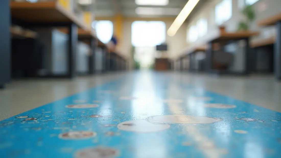
Floor space is the only advertising surface in a store that nobody is competing for. Walls have shelving, windows have merchandise, ceilings have sprinklers and HVAC — but the floor in front of the register is empty, and everyone walking toward it is looking down at it. That is why we print a lot of floor graphics: directional arrows in warehouses, spacing marks in clinics, logos in showroom entries, product callouts in the aisle. It is also why we ask more questions before printing a floor graphic than almost anything else. A decal on a wall that fails just looks bad. A decal on a floor that fails is something people step on, catch a toe on, and slip on. Here is what we check before anything goes on the press.
What a floor graphic actually is
A floor graphic is printed adhesive vinyl with a heavy anti-slip overlaminate on top of it. The laminate is the product. Without it you have a wall decal lying on the ground: the ink abrades off under shoe traffic within days, and the smooth printed surface turns into a hazard the first time a mop or a rainy shoe hits it. The laminate is thick, textured, and designed to be walked on — that is what you are paying for, and it is why floor material costs more per square foot than the same graphic on a window.
Our floor graphics start at $31.28, priced by size and quantity. Common formats are a 12- or 24-inch circle for spot marks, a 12x18 or 18x24 rectangle for directional and informational panels, and long runs of arrows or footprints for wayfinding. Circles and ovals cost the same as rectangles of the same area; the plotter does not care about the shape of the cut.
The floor decides, not the artwork
Adhesive needs continuous contact with a smooth, sealed, clean surface. Sealed concrete, VCT and vinyl plank, polished terrazzo, ceramic tile with tight grout, sealed hardwood and epoxy-coated floors all take vinyl well. Everything else is a conversation.
Grout lines are the most common problem we see. On a tile floor with 1/4-inch recessed grout, a large graphic bridges the gaps instead of adhering into them, and each unsupported line becomes a place where a shoe can lift an edge. Small graphics that fit inside a single tile are fine. Large ones on heavily grouted tile are not, and the honest answer is usually to shrink the design or move it to a smoother stretch of floor. Broom-finished or unsealed concrete has too much texture — the adhesive contacts the high points only. Carpet needs an entirely different film with a mechanical adhesive that grips the fibers; standard floor vinyl will not stay on it for an afternoon.
Two traps specific to commercial floors. First, floor finish: if the floor is VCT that gets stripped, waxed and burnished on a schedule, the vinyl bonds to the wax rather than to the tile, and when the decal comes up it takes a patch of finish with it. Ask the janitorial crew what is on the floor before you commit to placement. Second, curing: new concrete and new epoxy need to release moisture and solvents, and a month is the number to plan around. A graphic applied to a slab that is still curing will bubble from underneath.
Slip resistance is the part you cannot skip
This is the one place we push back hard on customers who want a cheaper build. A floor graphic in a public space should use a laminate with a published slip rating — the usual reference points are a wet static coefficient of friction at or above 0.5 under ANSI/NFSI B101.1, or a UL 410 slip-resistance listing. Those ratings exist because a smooth film on a floor is a liability, and because insurers and property managers in Los Angeles increasingly ask to see them before they will approve graphics in a lobby or a common area.
Practically, this means the surface of a proper floor graphic feels gritty, like fine sandpaper, and it will not look glossy. Customers occasionally ask for a high-gloss floor decal because the color pops in a mockup. We will not build one for a walking surface. If the graphic is going behind a counter where only staff stand, or under a display where nobody steps, that is a different situation and worth telling us about, because the material choice changes.
Textured laminate also has a cleaning consequence: the same grit that gives it traction holds dirt. A floor graphic in a high-traffic entry will look dingy long before the adhesive fails, and it cleans up with a damp mop, not a scrubber. Rotary floor machines and aggressive stripping chemicals destroy them.
How long they last
Set expectations by traffic, not by calendar. A directional arrow in a low-traffic office corridor can look good for a year. The same graphic in a grocery entry, crossed by thousands of shoes a day and by shopping cart wheels that grind grit into it, may be worn through in a couple of months. Wheels are worse than feet — cart casters and pallet jacks concentrate load on a small contact patch and will scuff a path across a graphic that pedestrians have not touched.
That is the right way to budget floor graphics: as a consumable that gets replaced, not as a permanent fixture. It is also an argument for keeping the design simple, since a worn arrow still reads as an arrow, while a worn photograph just looks damaged.
Designing for something people see at an angle
A floor graphic is almost never viewed straight down. Someone walking toward it sees it at maybe 30 degrees off the ground, which compresses everything along the direction of travel and makes text noticeably harder to read than the same text on a wall. Three consequences.
Type goes up a size. The old signage rule of an inch of cap height per ten feet of viewing distance is a floor for floor graphics, not a target — we round up. Keep the message to a few words; nobody reads a paragraph on the ground. Second, orient the text so it is upright to the person approaching from the direction that matters, and tell us which direction that is, because a decal that reads correctly from the door reads upside down from the aisle. Third, high contrast beats subtlety. A floor is scuffed, patterned, and unevenly lit, and mid-tone colors disappear into it. Dark type on a light field or the reverse survives; a gradient does not.
Send vector artwork at final size with fonts outlined, or raster art at 150 dpi at final size, which is plenty for something seen from six feet up. Add a quarter-inch of solid color bleed and keep critical elements a half inch inside the cut line — floors get bumped, and a border gives the edge something to lose.
Installing without an edge to trip on
Clean first, and clean more than you think you need to. Sweep, damp mop with plain water or an ammonia-free cleaner, then wipe with isopropyl alcohol and let it flash off. Any residue of floor finish, degreaser or mop soap is a release agent. The surface should be dry and between roughly 50 and 90 degrees, which in an unconditioned Valley warehouse in August means doing it in the morning.
Position the graphic with the liner still on, hinge it with masking tape, then peel and lay it down from the center outward with a squeegee, forcing air toward the edges. Then go around the entire perimeter with firm pressure — most floor graphics fail at an edge that was never properly seated, and once a corner lifts, a shoe finishes the job. Give it 24 hours before wet cleaning.
Where floor graphics are the wrong answer
Outdoors, mostly. Adhesive vinyl on a public sidewalk in Los Angeles is both a permitting question and a material one — sun-baked concrete runs far past the application temperature range, sidewalks are porous and dirty, and the graphic is exposed to weather and street cleaning. When the goal is to catch people on the sidewalk, an A-frame sidewalk sign from $94.99 does the job with swappable inserts, it comes inside at close, and it does not need anyone's approval to move it three feet. Planning where messages sit across a storefront and the ground in front of it is the kind of thing our outdoor advertising and signs work covers.
Inside, a floor graphic is also wrong for anything permanent or brand-critical. A logo you want intact in three years belongs at eye level: acrylic business signs start at $46.76 and stand off the wall on hardware, and acrylic printing from $90 gives you a full printed panel for a lobby or reception wall. Permanent identification at the entrance sits under signage and front signs. Use the floor for what the floor is good at — direction, sequence, spacing, and short messages aimed at people who are already moving.
Angels Print prints floor graphics, wall and window decals, sidewalk A-frames and acrylic panels at our shop at 8511 Lankershim Blvd in Sun Valley, for retail, warehouses, clinics, gyms and offices across the San Fernando Valley and greater Los Angeles. If you know your size and your floor is smooth and sealed, pick your dimensions and quantity and order online. If you are not sure whether your tile, your epoxy or your waxed VCT will hold vinyl, call us at (818) 806-9006 or bring a photo of the floor to the shop and we will tell you before you pay for a graphic that will not stay down.