

August 29, 2026
Updated
Linen Business Cards in Los Angeles: What the Texture Does to Your Ink
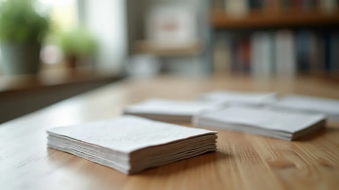
A linen business card is recognized with the thumb before it is read with the eye. Someone takes it, runs a finger across the face without thinking about it, and registers a fine cross-hatch grain instead of the flat slickness of a coated card. That half-second is the entire product. We print business cards every day at the shop on Lankershim, and linen is the stock people ask for by name when the card has to feel considered — attorneys, architects, therapists, estate agents, wine people, anyone whose work is sold on judgment rather than volume. It is also a stock with real constraints, and the constraints are all about what happens when ink meets a surface that is not flat.
What linen stock actually is
It is not linen. There is no flax fiber in it, and there has not been in most of what gets sold under the name for a very long time. Linen stock is ordinary uncoated paper that was run through a patterned steel nip at the mill after the sheet was formed — an embossing roller presses a fine woven-looking cross-hatch into the surface. The pattern is mechanical, it is uniform, and it goes into the surface rather than sitting on top of it, which is why it does not wear off at the corners the way a coating does.
Two things follow from that. First, the sheet is uncoated, so it is absorbent and it takes a ballpoint pen without smearing — you can write a price, an appointment time or a direct line on the back, which is impossible on a gloss card. Second, the printable surface is now peaks and valleys rather than a plane, and everything else in this article comes out of that.
Our linen business cards start at $28.93, and the default run is 50 pieces at $0.58 each. For comparison, classic business cards on smooth stock start at $25.70, 50 at $0.51 each. That is a difference of about seven cents a card. Nobody has ever made or lost a business on seven cents a card, so the decision is not a budget decision — it is a decision about what you want the card to feel like in a hand.
What the texture does to ink
Ink and toner land on the high points of the emboss first. In a large solid area — a dark navy field, a black back panel — you get microscopic voids in the valleys that read, from reading distance, as a very slightly lighter and softer version of the color you approved on screen. This is normal, it is what linen looks like, and it is also the reason a heavy full-bleed dark background is the one design choice we push back on most often. If your identity is a solid black card with white type, smooth stock will give you the black you are imagining. Linen will give you a charcoal with a visible weave.
The same effect works in your favor everywhere else. Mid-tone fields, warm neutrals, off-whites and anything with a bit of paper showing through look better on linen than on coated stock, because the texture breaks up the flatness that makes cheap cards look cheap.
Type, hairlines and the things that break up
The grain has a size, and any element in your artwork smaller than that grain is fighting it. Practical rules from cards we have had to reprint:
Set body text — the phone number, the email, the address line — at 7 points or larger, and prefer a face with open counters and a bit of weight. A hairline-thin modern serif at 5.5 points on linen loses parts of its thin strokes to the valleys, and the card reads as slightly out of focus. Keep rules and borders at 0.5 point or heavier; a 0.25 point hairline can go intermittent across a card. Reversed type — white knocked out of a dark field — needs to be a step larger and a step heavier than you would set it on smooth stock, because the ink creeping into the texture eats into the letterforms from both sides.
Photographs and fine gradients are the other casualty. A portrait on linen is soft and a bit dusty. That is charming for some brands and wrong for most. If the card is carrying an image, you want smooth.
QR codes do work, but give them room: at least three quarters of an inch square, quiet space around them, high contrast, and no clever tinting. Then scan a printed sample with an actual phone before you commit to the full quantity. A code that fails on textured stock fails silently — you never find out, because the person who could not scan it just put the card in a pocket.
Why uncoated matters in Los Angeles specifically
Cards here get handed over outdoors more than people account for. Patios in Studio City, open houses in the Valley at eleven in the morning, parking lots at trade events, sidewalk tables in the sun. A gloss card under direct Southern California light is a mirror — the person you just handed it to tilts it around trying to find an angle where the type is legible. Linen has no specular reflection at all. It reads in full sun exactly as it reads indoors.
Uncoated also means no fingerprints. A dark gloss card picks up every print from every hand it passes through and looks handled by the time it reaches a desk. Linen does not show them.
The trade-off is honest: uncoated stock is more absorbent, so a card that lives loose in a wallet against denim will soften at the corners faster than a laminated one. If your cards spend six months in a pocket before they get given out, that matters. If they go from a case to a hand, it does not.
When linen is the wrong stock
Three cases come up regularly at the counter.
If the card needs to be transparent — a design where the logo floats over whatever is behind it, common with architects and creative studios — no paper does that. Clear plastic business cards start at $92.60, 50 at $1.85 each. They are roughly three times the per-card cost of linen and they are a genuinely different object: waterproof, rigid, and impossible to write on.
If the card's idea is its outline — a rounded shape, a notch, a silhouette that matches your mark — that is a die job, not a stock choice. Die cut business cards start at $129.14 with a default run of 100 at $1.29 each. Keep the outline chunky; thin protrusions bend and tear in a pocket regardless of what they are cut from.
And if the design is photographic, or hangs on a deep solid black, or uses very small delicate type as its signature, go smooth. Choosing linen and then asking it to behave like coated stock is how people end up disappointed by a card that was printed correctly.
Getting the file right
Standard trim is 3.5 × 2 inches. Build the file at that size with an eighth of an inch of bleed on every edge, and keep all type and logos at least an eighth of an inch inside the trim line. Cards are cut in stacks, and the stack shifts slightly through a run, so a thin frame drawn near the edge will look centered on some cards and off on others. Do not design a border on a business card unless you are prepared for it to be uneven.
Supply vector art with fonts converted to outlines where you can. Raster elements should be 300 dpi at final size — a logo pulled off your website at 72 dpi will look worse on linen than on smooth, because the texture adds its own softness on top of the resampling. Build in CMYK and expect saturated screen blues and greens to come back calmer. Short runs go through our digital printing, which keeps color consistent card to card within a run, but it is still ink on an uncoated textured sheet, not a backlit display.
One last thing worth deciding before you send the file: linen has a grain direction. If you are ordering a card that will be scored and folded, tell us, because the fold should run with the grain or the fiber cracks along the crease. On a flat card it makes no difference and you can ignore it.
Angels Print prints linen, classic, clear plastic and die cut cards at 8511 Lankershim Blvd in Sun Valley, for firms and studios across the San Fernando Valley and greater Los Angeles — see business card printing in Los Angeles for the full range. If your artwork is ready, pick your quantity and order online. If you are weighing linen against smooth for a specific design, or you want to know whether your type is going to hold up on textured stock, call us at (818) 806-9006 or bring the file to the shop and we will look at it before you print a box of them.