

September 14, 2026
Signage and Front Signs in Glendale: Matching the Panel to the Street You're On
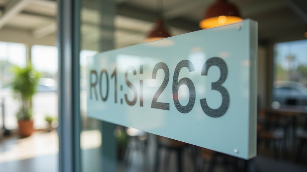
Glendale is not one street. A shop on Brand Boulevard near the Americana is read by someone on foot from twenty feet away, at walking speed, with time to look. A suite on San Fernando Road or Glenoaks is read from a lane of traffic doing forty, by a driver who has one glance to confirm they are at the right building. Those two readers want different signs, and most of the mistakes we see come from ordering the wrong one for the frontage you actually have.
We make signage and front signs at the shop in Sun Valley, a short run over the 134 from Glendale, and the first question we ask is never about material. It is: where is the person standing when they read this? Everything downstream — size, copy length, panel, mount — falls out of the answer.
Walk-up frontage and drive-by frontage are different products
The rough working number for legibility is one inch of capital letter height per ten feet of viewing distance, and more if the reader is moving. Go stand where your customer is. On a downtown Glendale block where people park in a structure and arrive on foot, that distance might be twenty-five feet of sidewalk — three-inch letters do real work there, and you have room for a second line.
On a corridor where the reader is in traffic, the distance is a hundred feet or more and closing fast. Now you are at ten inches of letter height and you get your name, nothing else. Every extra word you add is a word that forces the rest smaller, and a sign that is fully readable at a red light is not the same as a sign that is readable while moving past it.
The practical test: write down the shortest version of your sign copy that still identifies you, then cut one more thing. Hours, services, phone numbers and social handles belong on the door and the window, where somebody is standing still with their hand on the handle. They are wasted on the band above it.
Dibond is the default exterior panel
For a flat sign on an exterior wall, the material we reach for most is dibond aluminum, from $37.42. It is an aluminum composite — two thin aluminum skins bonded to a plastic core — and it stays flat, which is the whole reason it dominates exterior signage. Plain sheet aluminum of the same weight oil-cans in the sun: it ripples, and every ripple becomes a warped reflection running through your logotype.
It is light enough that the mounting hardware stays ordinary rather than structural, it cuts to shape cleanly, and it holds a hard printed edge. For a name band above a storefront window, a panel dropping into the frame the last tenant left behind, a directory at the back of a lot, or a wall sign facing a parking structure ramp, it is usually the right answer without much argument.
What it is not: a substitute for individually cut letters. A panel reads as a panel. If the look you have in your head is letters that appear to float on the wall with the wall showing between them, that is a different fabrication and it is worth saying out loud before anything gets printed rectangular.
Standoffs buy you a shadow line
An acrylic standoff sign starts at $37.50, and the small metal barrels at the corners are doing two separate jobs. One is mechanical. The other is optical, and it is why this mount looks more expensive than it is.
Holding the panel a half inch off the wall throws a shadow under and around it. Your eye reads that shadow as permanent and installed — as opposed to a flat panel bonded straight to the surface, which reads as temporary no matter how clean the print is. It also gets the panel off a wall that is rarely as flat as it looks. Downtown Glendale has a lot of older masonry and tiled bulkheads mixed in with newer construction, and a directly glued panel telegraphs every high spot in the substrate.
The cost is holes. Four drilled points in the panel, four anchors in the wall, and the anchor is entirely a question of what the wall is made of. Stucco over wood framing, a brick face, a glass transom and a concrete tilt-up are four genuinely different installs. Know which one you have before you order artwork, because the panel is the easy half.
Past the door, finish replaces size
Inside, the reading distance collapses to a few feet and the whole calculation changes. Letter height stops being the constraint and finish starts being it, because people are close enough to see thickness, edge quality and whether the thing is hanging straight.
That is the job acrylic business signs do, from $46.76 — the panel behind a reception desk, the suite number beside a door, a name plate in a shared lobby in one of the downtown office buildings where a dozen businesses list off one elevator bank. At that distance the material thickness and the shadow it throws are carrying most of the visual weight.
Keep one category separate: ADA signage has its own rules. Tactile characters, grade 2 braille, defined mounting heights and non-glare finishes are requirements for things like restroom and permanent room identification, and a printed acrylic panel is not automatically any of that. If the sign has a code function, confirm what applies to your space before artwork — it is a different product, not a different print file.
If your copy is bilingual, plan the space for it
Plenty of Glendale businesses run signage in English plus Armenian, Spanish or both, and the failure mode is always the same: the second line gets added after the layout is settled, so it lands at half the size of the first and becomes decoration nobody can read at distance.
Decide the hierarchy up front. Usually one language carries the name at full size and the other carries a short descriptor beneath it at a deliberate, readable size — not whatever is left over. Armenian letterforms have different proportions and counters than Latin ones, so a point size that looks matched on screen often is not matched on the wall. Print a section at full scale and look at it from the curb before committing the panel.
The banner is the honest interim sign
Permanent signage takes time that a lease does not always give you. A vinyl banner from $67 is the standard bridge: you are open, the permanent sign is in process, and something has to tell the street.
Make it a real banner, not a poster that got rained on. Hemmed edges and grommets on all four sides, tied at every grommet rather than just the corners, tensioned flat. A banner secured at four points only will beat itself against the building through one windy week and tear out at the grommets. On exposed frontage, size it for the wind at the design stage — a slightly smaller sign that stays up beats a larger one in the parking lot.
Banners keep earning after the permanent sign goes in, too: openings, seasonal promotions, and sidewalk-facing messages on the walkable blocks where foot traffic is genuinely there.
Glendale permits its own signs
This is the part people from the rest of the Valley get wrong. Glendale is an independent city with its own planning department and its own sign regulations — North Hollywood or Sun Valley goes through the City of Los Angeles, and Glendale does not. What a friend did on their storefront two miles away may not be the rule on your parcel.
Permanent exterior signage and anything illuminated is generally permitted work, and what you are allowed depends on your specific zoning and, in parts of the downtown area, on additional design standards. The second gate is your lease: commercial leases routinely reserve sign approval to the landlord, and multi-tenant buildings often have an established sign band every tenant is expected to live inside.
We print and fabricate the sign. We cannot pull your permit or clear your lease, so take those two questions to the city and your landlord early — a written OK on size and placement before artwork is far cheaper than after. Our Glendale signage page lays out the same panel options in one place if you want to hand something to a landlord.
Look at the wall before you finish the design
Check the sun. A west-facing frontage on a hot afternoon fades ink in a predictable order — reds and magentas first, then yellows, while blacks, deep blues and greens hold much longer. A logo built around a bright red will drift over a couple of summers in a way the same logo in dark blue simply will not. That is worth knowing at layout, not at replacement.
Then look at what surrounds the sign. Glare bouncing off the glass tower across the street, a street tree throwing dapple across the panel half the day, an awning that eats the top four inches from the sidewalk angle — those decide placement more than the material does. Stand where the customer stands, at the hour they actually come.
Files
Send vector artwork with fonts outlined, built at final size, with bleed all round. Keep critical copy well inside the panel edge, and further inside on a standoff sign, since the mounting holes need clear space at the corners. Build in CMYK.
Resolution expectations are lower than print people assume for anything read from a traffic lane — a photo at 100 to 150 ppi at full size is fine when nobody inspects it from a foot away. Interior acrylic is the opposite: people will be close, so send the real file, not an export from a slide deck. Give us finished dimensions in inches, tell us which wall it is going on, and tell us what that wall is made of.
Angels Print makes storefront panels, standoff signage, interior acrylic and banners at 8511 Lankershim Blvd in Sun Valley, for businesses across Glendale and the surrounding area. If your artwork is ready, pick your size and order online. If you are still working out letter height, which panel suits your frontage, or how it attaches to the wall you have, call (818) 806-9006 or bring photos of the storefront into the shop and we will work through it with you first.