

September 1, 2026
Raised Spot UV Business Cards in Los Angeles: What Actually Gets Raised, and What It Costs
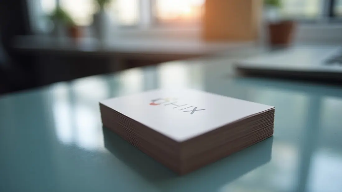
A raised spot UV card is the one people turn over in their hands before they put it in a pocket. The effect is simple and entirely physical: a clear resin is cured on top of the printed sheet in a shape you specify, so part of the card is glossy and sits above the surface while everything around it stays matte and flat. You feel it before you read it. We print these at the shop on Lankershim for tattoo artists, salons, agents, restaurants, photographers and consultants across the Valley, and the difference between a card that gets kept and a card that gets recycled almost always comes down to two decisions made in the file — what gets raised, and what it sits on.
What raised spot UV is, and what it is not
It is a clear coating applied to selected areas only, then cured hard. It has height you can feel with a thumbnail, it is glossy, and it is colourless — it takes its colour from whatever is printed underneath it. If you put the raise over black, you get glossy black on matte black. If you put it over nothing, you get a clear glossy shape on white paper, which is subtler than most people expect and reads best in raking light.
It is not embossing. Embossing pushes the sheet from behind with a die, so the back of the card carries a recessed mirror image of the front. Raised UV adds material to the surface, so the back of your card is untouched and can carry full artwork with no ghosting. If you have been told you cannot print on the reverse of a raised card, that advice belongs to embossing, not to this process.
It is also not foil. There is no metallic layer. If the shine you have in your head is gold or silver, raised UV will not get you there — it will get you a wet, lacquered gloss instead.
Our raised spot UV business cards start at $64.67, with a default run of 50 pieces at $1.29 each.
The finish underneath does most of the work
The raise is only visible because of contrast. On a gloss-laminated card, a gloss coating on top of gloss is nearly invisible in a photograph and only announces itself by touch. On a matte or soft-touch surface, the same shape jumps — the eye reads two different materials on one plane before it reads any of your copy.
So the practical rule is: matte or soft touch under the raise, always. Then decide how much of the card is doing the work. Dark, saturated backgrounds give the strongest result because the gloss picks up a highlight along every edge of the raised shape. A raised logo on a deep navy or near-black field is the version of this card that people actually notice. A raised logo on a white card is elegant and quiet, and you should look at it in your hand before committing a full run to it, because it photographs poorly and clients often expect more.
One warning about soft touch specifically: it is a fingerprint magnet, particularly in dark colours. Cards that live in a jacket pocket for a month will show handling. That is a property of the laminate, not a defect, and it is worth knowing before you pick the darkest possible background.
Raise the one thing, not everything
The most common way this product disappoints is that somebody raises all of it. Logo, name, title, phone, email, three social icons, a border and a background pattern. When ninety percent of the face is raised, nothing is raised — you have paid for a gloss-laminated card with a strange texture.
Pick one element. Usually the logo or the mark. Occasionally a single graphic — a pattern block, a stripe, an illustration that is the whole brand. Leave the contact details flat and matte, where they are easiest to read. The raise is emphasis, and emphasis only exists where there is something ordinary to compare it against.
There is a second reason to be restrained: raised gloss over small type reduces legibility. Nine-point text under a shiny coating catches reflections and gets harder to read at exactly the moment somebody is trying to copy your number into a phone.
Building the file
Standard card prep, plus one extra layer. Set the artwork at final size with an eighth of an inch of bleed all round, keep type and logos at least an eighth of an inch inside the trim, build in CMYK at 300 dpi or supply vector with fonts outlined.
Then supply the raise as its own separate file or a clearly named layer, drawn as solid 100% black vector shapes on a transparent or white background — black means coat here, blank means leave it. Do not send a screenshot of your card with the shiny bits highlighted, and do not send a greyscale image expecting different densities to produce different heights. The coating is on or off; there is no 40% raise.
Three geometry notes that save reprints. Keep the raised shapes reasonably chunky — hairlines thinner than about half a point and delicate serifs may not hold a clean edge. Keep the raise back from the trim edge by at least an eighth of an inch, because a coated shape running off the cut is where chipping starts. And make sure the raise layer sits in exact register with the printed art below it; if your logo and your raise are separately drawn versions of the same shape, they will not line up, so build the raise by duplicating the printed vector, not by redrawing it.
When a plainer card is the right call
Not every card should cost a dollar twenty-nine. If you are handing out five hundred cards a month at events, or you need a stack for a staff member who leaves them everywhere, the maths stops favouring the finish. Our classic business cards start at $25.70, with a default run of 50 at $0.51 each. Many of our customers run both: a plain card for volume, a raised card for the twenty conversations a month that actually matter.
There is also a job raised UV genuinely cannot do. Nothing writes on it. A ballpoint skids off a coated laminate, so if your card doubles as an appointment reminder with a date written on the back, either leave an uncoated writing panel or use a different stock entirely.
If what you are chasing is not gloss but a different object, price the alternatives before you decide. Clear plastic business cards start at $92.60, with a default run of 50 at $1.85 each, and they get attention through transparency rather than texture — strong for anything where seeing through the card is the idea. Die cut business cards start at $129.14, with a default run of 100 at $1.29 each, and they change the silhouette, which is the one thing a rectangle can never do no matter what you coat it with.
Ordering, proofing and the Los Angeles part
Short runs go through our digital printing process, which keeps colour steady piece to piece within a run. If your brand colour has to match a sign, a menu or a previously printed card, ask for a printed sample before a large order — and evaluate it in daylight and under warm indoor light, because the raise reads very differently under each.
Two local realities worth planning for. First, heat: a box of laminated cards left in a car through a Valley summer can block together at the edges under weight. Store them indoors, flat, out of the sun, and carry a small holder rather than the whole carton. Second, audience. In this city a card gets handed over at a shoot, a showroom, a job site or a table at a restaurant, often in bad light and often to somebody holding a phone in the other hand. A card that is identifiable by touch survives that exchange better than one that relies on being looked at carefully.
Angels Print prints raised spot UV cards, classic cards, clear plastic cards and die cut cards at our shop at 8511 Lankershim Blvd in Sun Valley, and everything else on our business card printing side. If your artwork is ready and your raise layer is drawn, pick your quantity and order online. If you are not sure which element should be raised, or whether your logo has enough weight to hold the coating, call us at (818) 806-9006 or bring the file to the shop and we will look at it together before you pay for a run.