

September 1, 2026
Restaurant Sidewalk Signs in Los Angeles: Wind, Right-of-Way and the Sign That Gets Read at Six Feet
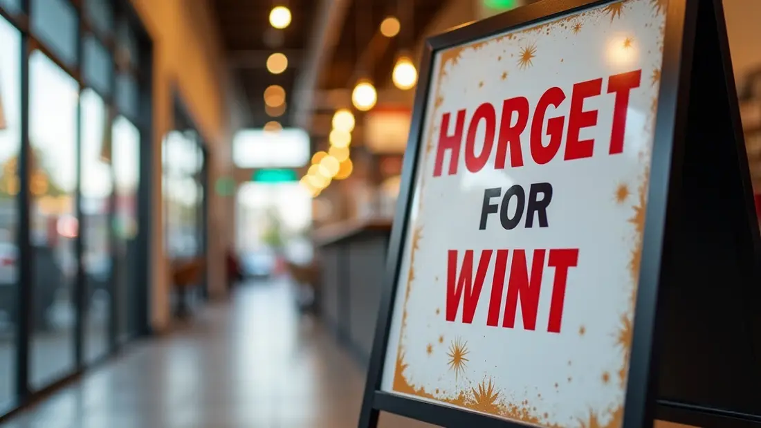
A sidewalk sign is the cheapest square foot of advertising a restaurant will ever buy, and it is the only one that gets a person who was already walking past to stop, turn and come in. It works at a distance of about six feet, for roughly two seconds, on someone who is mid-conversation and looking at their phone. That is the whole job. We print and build these at the shop on Lankershim for restaurants, cafés, taquerias, bakeries and bars across the San Fernando Valley and greater Los Angeles, and the ones that fail almost never fail because the printing was bad. They fail because the sign blew into traffic, because the city made it disappear, or because it tried to say eleven things and said none of them.
What the sign has to survive before it sells anything
Before you think about the artwork, think about the week this object is going to have. It gets carried out at open and dragged in at close, seven days, which is roughly seven hundred handling cycles a year. It sits in full Valley sun from late morning until the sun drops behind the buildings. It gets bumped by strollers and dogs, sprayed by the guy hosing the sidewalk next door, and shoved by the wind off every truck that passes. On a bad night somebody walks off with it.
Every one of those is a spec decision, not a design decision. A sign that is a joy to look at and a misery to carry will end up staying inside on the days you are busiest. Pick the size you will actually move twice a day, not the biggest one that fits the frontage.
The two formats, and which one your block wants
Our restaurant sidewalk signs start at $55, with the size and options chosen in the configurator. This is the format for a restaurant that knows what it wants to say and wants it printed, weather-ready and out on the pavement without much ceremony — the day's identity, the thing you are known for, the arrow that says the door is here.
The A-frame sidewalk sign starts at $94.99 and is the folding two-panel version: it stands on its own, it presents a face to each direction of foot traffic, and it collapses flat to go behind the host stand at close. You pay more because you are buying the structure as well as the print, and because the A-shape is what gives it a wide footprint and a low centre of gravity. On an exposed corner, that footprint is the entire reason the sign is still upright at four in the afternoon.
The honest way to choose between them is to stand outside your own door at your busiest hour and watch where people's eyes go. If your frontage is deep and set back, you need something that pushes out toward the sidewalk edge. If you are flush to a narrow sidewalk on a busy street, a smaller, tighter sign is the one that will not get you a complaint.
Answer the right-of-way question before you print anything
This is the part restaurants skip, and it is the only part that can turn a sign into a total loss. A public sidewalk is public right-of-way. What you may place on it, how far it may project, and whether you need a permit are decisions the city and — on some blocks — a business improvement district make, not decisions you make. Rules also differ depending on whether the sign sits on the public sidewalk or entirely on your own private frontage or patio, and outdoor dining permits have shifted where those lines fall on a lot of LA streets.
We are not going to quote you code sections, because they vary by street and they change. Call the city, or walk into the counter that handles your address, and get the answer for your specific frontage before you commit. Two things are worth knowing in advance regardless: accessibility law requires a continuous unobstructed path for wheelchairs, and cities typically want several feet of clear sidewalk width kept open at all times — confirm the number that applies to your block, then place the sign against the building line or at the curb line so the walking lane down the middle stays clean. A sign that narrows the path is the one that generates the complaint that generates the visit.
Wind on a boulevard is not weather, it is traffic
Most sidewalk signs in Los Angeles do not get knocked over by storms. They get knocked over by the pressure wave off a box truck on Lankershim or Victory, and by the afternoon gusts that funnel between buildings. A large flat panel is a sail, and a sail that is not anchored is a projectile heading toward parked cars.
Weight it. Sandbags on the lower rail, a ballasted or water-fillable base, or the sign standing where the building shelters it — any of these, but not none of them. Keep tall narrow proportions for sheltered doorways and wider, lower proportions for exposed corners. And bring it in at close: the overnight hours are when nobody is watching, and a sign that spends every night on the sidewalk is a sign you will be replacing.
Design for six feet, not for a photograph
The single most common mistake we see is a sidewalk sign designed as if it were a menu. Eleven items, three fonts, a paragraph about the family history, and a QR code at ankle height. Nobody stops for that.
One idea per side. Something they can want in two seconds: the dish, the price, the deal, the smell you are famous for. Big type — the headline should be readable from across the sidewalk without leaning in — dark ink on a light field or the reverse, and no thin script for anything that matters. If a QR code earns its place, put it in the upper half where a phone can actually see it, not in the bottom corner where a person has to crouch.
Chalkboard styling is popular and it works, but decide which you want: a real chalk surface that your staff rewrites daily and that will look tired by Thursday, or a printed panel that looks like a chalkboard and looks exactly as good in month six as on day one. There is a middle route we build often — a printed panel carrying the permanent things, with one deliberate blank zone sized for a chalk marker so the special can change without the whole sign changing.
Two sides are two different signs
An A-frame faces both directions of foot traffic, and those are not the same audience. People coming from the parking structure are looking for somewhere to eat. People coming from the office block at 2 p.m. already ate and are looking for coffee. Print the two faces differently and the sign works twice. Printing the same artwork on both sides is the default, and it is a wasted half.
Heat, fade and the dark-panel problem
Sun Valley summers are hard on outdoor print. Direct UV all afternoon will lift colour out of anything unprotected, and reds and deep blues go first — a sign that has faded unevenly reads as a restaurant that stopped caring. Ask us for a UV laminate on any panel that lives outdoors full time; it is a small line on the invoice and it is the difference between one season and several.
Heat matters mechanically too. A dark panel in full sun gets genuinely hot to the touch, hot enough that your staff will not want to carry it in at 3 p.m. and hot enough to soften some substrates over time. If the frontage faces west with no shade, a lighter background is not just a design preference. Store the sign folded and flat indoors, not leaning against a wall in a hot storeroom for six months.
The signs that belong on the wall, not the sidewalk
A sidewalk sign is one piece of a storefront, and it works best when it is not doing everyone else's job. Hours, health permit display, delivery-app stickers, the reserved-parking notice, the name plate by the door — those want a fixed, permanent surface. Acrylic business signs start at $46.76 and are the clean way to handle the small permanent things without cluttering the sidewalk sign with information nobody stops to read.
For a full wall menu inside the door, a specials board in the waiting area or a large panel that has to look sharp under interior lighting, acrylic printing starts at $90. Printed acrylic reads as depth and gloss rather than as paper behind glass, which is why it survives in a room where customers stand three feet away with nothing to do but look at it. If you are working out the whole frontage at once — sign band, window, door, sidewalk — that is our signage and front signs work, and the pieces that face the street and the traffic sit under outdoor advertising and signs.
Files, and what to send us
Vector artwork with fonts outlined is ideal. If you only have a logo from a social media account, tell us — a 600-pixel logo blown up to a two-foot panel turns to mush, and it is much better to rebuild it before printing than to discover it on the sidewalk. Build in CMYK, keep an eighth of an inch of bleed all round, and hold critical text well inside the trim. Remember that some of the panel edge may sit inside a frame channel, so nothing important should live in the outer margin.
One last note on colour: what looks rich on a backlit laptop screen at midnight looks different on a printed panel in flat noon sun. If a brand colour has to match something already on your storefront, bring the physical thing in and let us look at it against a printed sample rather than matching to a screenshot.
Angels Print prints restaurant sidewalk signs, A-frames, acrylic business signs and acrylic panels at 8511 Lankershim Blvd in Sun Valley, for restaurants and cafés across the San Fernando Valley and greater Los Angeles. If your artwork is ready and you know your size, pick your options and order online. If you are still working out what your frontage allows, how heavy the sign needs to be for your corner, or whether the special should be printed or written in chalk, call us at (818) 806-9006 or bring a photo of your storefront to the shop and we will work it out with you before anything gets printed.