

September 2, 2026
Updated
Silk Business Cards in Los Angeles: What the Laminate Actually Does, and When It Is the Wrong Choice
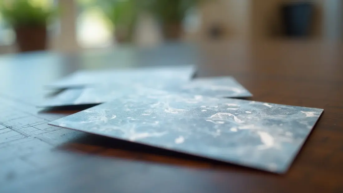
Somebody hands you a card and you notice the surface before you read a word on it. That is the entire argument for silk. We print business cards at the shop on Lankershim in Sun Valley for people all over the San Fernando Valley and greater Los Angeles, and silk is the finish customers most often ask for by feel rather than by name — "the soft one", "the one that isn't shiny", "the peach-skin one". It is a real, specific product with real trade-offs, and a few of those trade-offs surprise people after the box is already on their desk.
What a silk card actually is
A silk business card is a printed card sealed on both sides with a thin soft-touch laminate film. The film is what you are buying. It is not a paper texture, not an uncoated stock, not a matte ink — it is a plastic layer bonded over the print, and it changes four things at once: how the card feels, how thick and rigid it is, how the colours read, and how it survives a pocket.
The feel is the obvious one. Soft-touch laminate has a velvety drag to it, closer to the back of a phone case than to paper. The rigidity is the one people underestimate: two layers of film over the card stock make it noticeably stiffer than a bare card of the same weight, so it does not curl in a wallet and it does not go soft in a humid restaurant. The durability follows from that. Water beads on it. Fingers do not leave marks the way they do on gloss. The corners take a beating and stay square.
Our silk business cards start at $35.81, which is 50 pieces at $0.72 each on the default run, with size, quantity and options picked in the configurator. Compare that to classic business cards at $25.70 for 50 at $0.51 each and you can see exactly what the laminate costs: about twenty cents a card at the small end, less as the run grows. That is the whole decision in one line.
The colour shift nobody warns you about
Soft-touch laminate mutes. It knocks a little life out of saturated colour and it lifts blacks toward a deep charcoal-grey rather than a hard black. On a design built from muted tones, greys, dusty blues, earth colours, this is a gift — the card looks expensive and composed. On a design built from one screaming brand colour, it can look like the print came out weak.
So the rule we give people is simple: if your brand lives on a bright single colour and that colour matching matters, either build the artwork a touch richer than looks right on screen, or come by and look at printed samples in daylight before you commit to a run. What looks correct on a backlit monitor at midnight is not what a laminated card looks like on a table.
There is a related effect that works in your favour. Because the surface is dead flat and non-reflective, anything glossy placed on top of it reads with enormous contrast — a spot gloss logo on a silk card looks almost wet. That contrast is the reason silk is the base for so much of the premium card work we do.
The two jobs silk is bad at
First: you cannot reliably write on it. This catches out a lot of people, and it catches out exactly the professions that write on cards the most — real estate agents jotting a showing time, contractors writing a quote figure on the back, doctors and dentists writing the next appointment. Ballpoint skates on the laminate. Gel and marker sit on the surface and smear until they dry, and sometimes never fully dry. If writing on the back of the card is part of how you work, silk is the wrong finish, and no amount of liking the feel will fix it. Ask us to leave one side unlaminated, or go with a plain uncoated card instead.
Second: silk is quiet. It is a finish that rewards a close look and a held moment, which is perfect if you hand cards over one at a time in a conversation. It is less effective on a table at a trade show next to forty other cards, where the thing that gets picked up is the one that looks different from three feet away. If your card has to win a stack rather than a handshake, a shape or a material does more work than a surface. Die cut business cards start at $129.14, which is 100 pieces at $1.29 each, and they win by outline — a rounded corner, a notch, a silhouette that follows your logo — before anyone has read a word. Clear plastic business cards start at $92.60, 50 at $1.85 each, and they win because you can see the table through them.
Those two cost three to five times what a silk card costs. That is the honest framing: silk buys you a better version of a normal card, and it does it cheaply. The other two buy you a card that stops being a card and starts being an object.
Who silk is actually right for
In our experience the finish earns its keep for people selling taste rather than availability. Architects, interior designers, photographers, salons and barbers, boutique fitness and wellness studios, coffee roasters, tattoo artists, brand and creative consultants, high-end trades where the client is comparing three bids and one of them arrived with a card that felt considered.
It also earns its keep anywhere the card lives a hard life. Restaurant and bar staff, event people, anyone whose cards spend the night in an apron pocket or a jacket that gets rained on once a winter. A gloss card in that pocket comes out scratched and fingerprinted. A silk card comes out looking like it did that morning.
Where we would talk you out of it: high-volume handouts where the card is disposable by design, anything you plan to write on, and any run where the extra twenty cents a card matters more than the impression. There is no shame in a well-printed plain card. Most of what makes a business card good is layout, hierarchy and ink density, not finish.
Design notes specific to this finish
Keep an eighth of an inch of bleed on every edge and hold anything you care about — phone numbers, the last line of an address, a QR code — well inside the trim. Laminated cards are trimmed through the film, and the film does not forgive text that crowds the cut.
Watch fine detail in light ink. Hairline rules and small type under 6pt lose a little crispness under laminate, because the film sits above the ink and softens the edge microscopically. It is not a defect, it is physics, and the fix is to set your smallest type slightly larger or slightly bolder than you would on an uncoated card.
Full-bleed dark backgrounds are where silk looks best, and they are also where the laminate saves you. A solid dark field on an unlaminated card shows every fingerprint and every scuff from the box. Under soft-touch, it stays clean.
Send vector artwork with fonts outlined, built in CMYK. If all you have is a logo pulled off an Instagram profile, tell us before we print rather than after — a 500-pixel logo on a card at print resolution turns to mush, and rebuilding it first is cheaper than reprinting.
Ordering
If you know your quantity and your artwork is ready, pick your options and order silk business cards online. If you want to compare finishes across a whole card programme — silk for the owner, plain for the crew who write on them, something structural for the trade show table — that is our business card printing in Los Angeles work, and the presses behind all of it are described under digital printing.
And if you are not sure yet whether the soft-touch is right for how you actually hand cards to people, come to 8511 Lankershim Blvd in Sun Valley and hold a few. Five minutes with printed samples settles this faster than any description does. Call us at (818) 806-9006 if you want to talk through the artwork first.