

August 28, 2026
Kraft Business Cards in Los Angeles: What Prints on Brown and What Doesn't
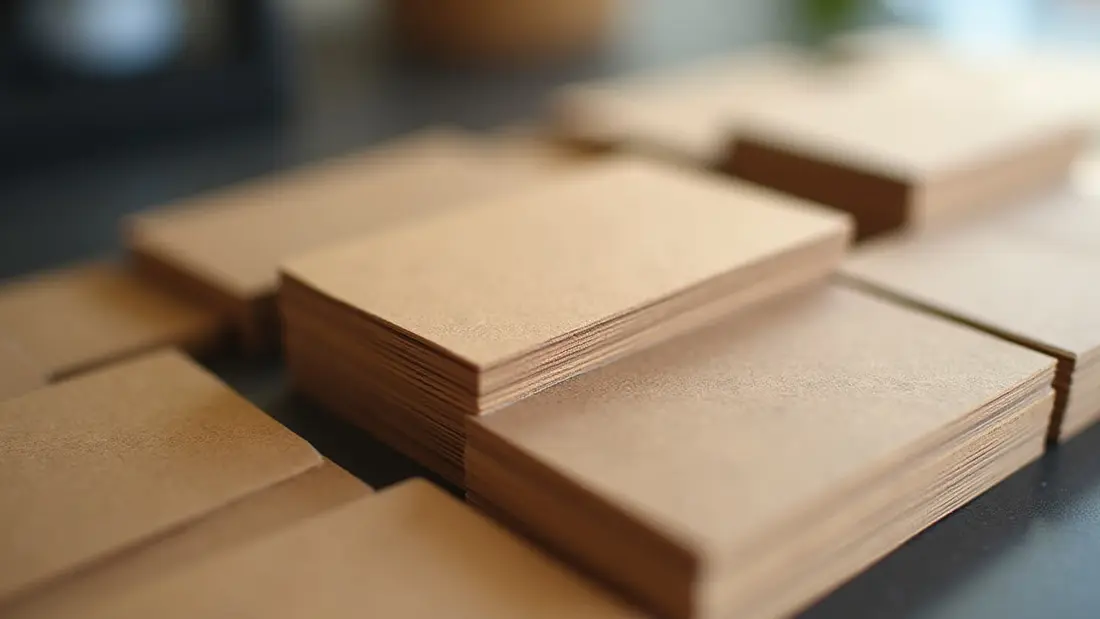
Somebody brings us a logo, we ask what stock, and the answer is "the brown recycled one, like the coffee bag." That is kraft, and it is one of the most requested specialty stocks we run at the shop on Lankershim — coffee roasters, barbers, tattoo shops, small-batch skincare, woodworkers, food trucks, farmers market vendors, anybody whose brand is built on the idea that the thing was made by hand. It is also the stock where the file that looked perfect on screen comes back looking muddy, because kraft breaks the one assumption every design file makes: that the paper underneath is white.
What kraft stock actually is
Kraft paper is pulped with a process that leaves the lignin in and skips the bleaching, which is where the brown comes from and also why it is stronger than bleached paper of the same weight. It is uncoated, slightly rough, and if you hold it to the light you will see darker fibre flecks scattered through it. Those flecks are not a defect. They are the entire reason people pick it, and a client who wants an absolutely uniform surface does not want kraft.
One consequence of an unbleached fibre: the base colour drifts. A kraft sheet from one mill batch runs a shade warmer or cooler than the next. It is not a wide swing, but if you order kraft business cards in January and reorder in June, hold the two next to each other and you may see it. If exact colour matching between runs matters more to you than texture does, kraft is the wrong stock and we will say so.
There is no white ink
This is the whole game. Our kraft cards are printed in CMYK on brown, without a white underbase, and everything that surprises people follows from that.
Ink is transparent. On white paper the sheet itself supplies the brightness and the ink filters it. On kraft, the brown supplies it, so every colour prints darker, warmer and duller than the same file on white. A clean blue goes slate. A bright red goes brick. A yellow more or less vanishes — yellow ink on brown paper is barely a change. And anything you left white in the file does not print at all; it is simply bare kraft. Where your design has white text on a coloured block, the text comes out brown. Where it has a white logo on a dark field, you get a brown logo.
Once you accept that, the design gets easier, not harder. Treat brown as your background colour and pick everything else to sit on top of it.
Colours that survive the brown
Black is the safest thing you can print on kraft, and a solid black on kraft is a genuinely handsome combination — it is why so much specialty coffee packaging looks the way it does. Deep navy, forest green, burgundy, charcoal and rich browns all hold up. Metallic-looking golds and coppers do not exist in CMYK, but a warm dark ochre reads convincingly against kraft because the paper is already halfway there.
What fails: pastels, anything pale, yellow, light grey, sky blue, mint, and photographic images with bright skin tones or an open sky. A photo on kraft looks like a photo printed on a paper bag, because it is.
If your brand colour is a light one, the move is a knockout in reverse: print a solid dark field and let the kraft show through as your light element. The bare paper becomes the highlight. That is the one "white" you have, and it is brown.
Design that suits the substrate
Kraft rewards line art, heavy simple marks and type with weight. Thin hairlines and 6pt type sink into an uncoated surface — ink spreads slightly into the fibres, so fine detail closes up in a way it does not on a coated sheet. Bump your smallest type a point and use a weight heavier than you would on white.
QR codes need care. A scanner wants contrast between the dark modules and the light background, and brown is not a light background. A solid black code on bare kraft usually scans, but "usually" is not good enough for something printed a thousand times. Print a proof, scan it with two different phones in ordinary indoor light, and only then commit to a quantity.
One real advantage of uncoated stock: it takes a pen. Ballpoint, gel and pencil all write cleanly on kraft, which a glossy card will not accept. If your card doubles as a loyalty punch card, an appointment reminder or something a stylist writes a date on, leave a clear strip for it. And do not ask for a gloss coating on kraft — coating it would flatten the exact texture you are paying for.
What it costs against a plain white card
Kraft business cards start at $63.80, and the default run is 50 pieces at $1.28 each. A classic business card starts at $25.70, 50 pieces at $0.51 each. So kraft costs roughly two and a half times per piece, and it is worth being honest about what that buys.
It buys nothing at all in terms of information delivered. The phone number is the same phone number. What it buys is that the card feels like your product before anybody reads it, which matters enormously for a roaster or a soap maker and matters not at all for a mortgage broker. If you hand out four hundred cards a month at events, the plain stock is the correct answer and the money belongs somewhere else. If you hand out thirty a month to people walking out of your shop with a bag in their hand, the texture is doing real work.
When kraft is the wrong choice
Photographs, gradients and any brand built on bright colour: use white stock. Nothing in setup will rescue a pastel palette on brown.
If the goal is that the card looks unlike everything else in a stack, there are cleaner ways to get there. Clear plastic business cards start at $92.60, 50 pieces at $1.85 each, and they get the same double-take from a completely different direction — the card is transparent, so the surprise is structural rather than tactile. Die cut business cards start at $129.14 with a default run of 100 at $1.29 each, and a shaped outline survives being seen from across a table in a way a texture does not. Texture is a thing you notice in the hand. Shape is a thing you notice at distance. Pick by how the card gets received.
Files we can print without a conversation
Build at final size with an eighth of an inch of bleed on all four edges, keep text and logos an eighth of an inch inside the trim, and supply vector art with fonts outlined wherever you can. Any raster element should be 300 dpi at final size.
Two kraft-specific notes. First, delete every white object in the file, or at least know that it will not print — designers routinely leave a white background layer in place and are then startled when the card arrives with no background. Second, do not build a thin border around the edge. Cutting moves a fraction across a run, and a two-millimetre frame that is centred on the first card will look crooked on the fortieth. Short runs go through our digital printing process, so colour stays consistent piece to piece within a run — but consistent on brown is still darker than your monitor, and no proof on a backlit screen will tell you otherwise. If the colour is critical, ask us for a printed sample before the full quantity.
Angels Print prints kraft, classic, clear plastic and die cut cards at 8511 Lankershim Blvd in Sun Valley, for shops, studios and makers across the San Fernando Valley and greater Los Angeles. If your artwork is already black-on-brown and ready, pick your quantity and order online from our business card printing page. If you are not sure how your colours will land on an unbleached sheet, whether your QR code will scan, or whether kraft is worth two and a half times a plain card for the way you actually hand them out — call us at (818) 806-9006 or bring the file to the shop and we will look at it on the stock before you print five hundred.